Art Newsletter Website
Desktop | Phone | Tablet | Rebuild | Migration | Updates
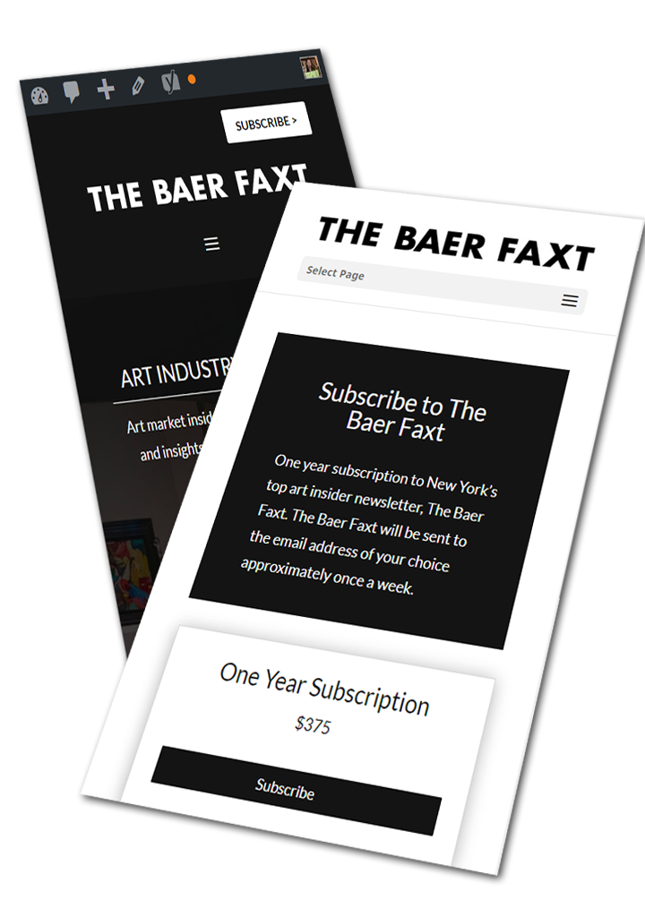
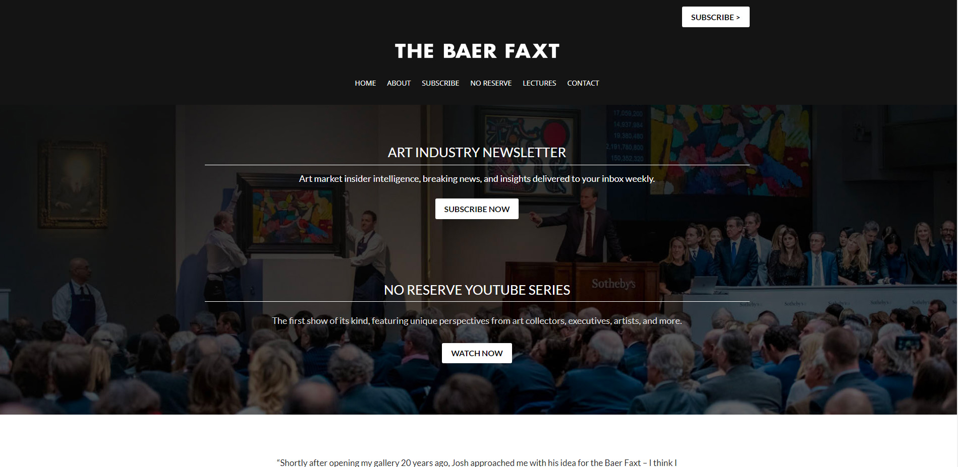
This website was hosted on an account owned by a previous developer who had gone AWOL. Without any control over the site, I was asked to rebuild the site, keeping the same aesthetics, and move it to a new server.
Project Summary
This website had been built on a server owned and operated by a former developer. The developer had been unreachable for quite some time and the website had become old and corrupted and infected with malware. We didn’t have access to the server but we did have access to the WP backend of the site. Through the backend, I was able to download a copy of the site and its database and migrate it to a new server. Updates were made and the folder and files were scrubbed for malicious script.
Project Details
Client Name
The Baer Faxt
Project duration
1 Month
Strategy
Using WP All-in-One Migration plugin plus the pro addon, I was able to easily migrate this site to a new server since we had backend access to the old site. The original domain was still controlled by the old developer. The client purchased a similar one which we pointed to the new server and I installed simple page-by-page 301 redirects on the old site to the new site. This method, rather than a full redirect, allows me to continue to access the backend of the old site until we are once again able to gain control over the old hosting account.
Once migrated, I was able to clean up the site, make the necessary updates, changed to Divi from an outdated and no longer supported theme – keeping the same design, added in the missing SEO, and made sure all connections to the merchant system remained intact.
UX Design
The original site was using a paid theme that was no longer supported and had conflicting issues with WooCommerce. I switched the theme to Divi and rebuilt the theme look to match that of the original.

Visual Design
This is a fairly basic black and white site.

Dark Grey
#141414

Basic White
#ffffff

Lighter Dark Grey
#212529

Link BLue
#2ea3f2
HEADERS
Aa
Lato 32pt
Lato 24pt
Lato 16pt
Lato 14pt
“Lato is a sans serif typeface family started in the summer of 2010 by Warsaw-based designer Łukasz Dziedzic (“Lato” means “Summer” in Polish). In December 2010 the Lato family was published under the Open Font License by his foundry tyPoland, with support from Google.
In the last ten or so years, during which Łukasz has been designing type, most of his projects were rooted in a particular design task that he needed to solve. With Lato, it was no different. Originally, the family was conceived as a set of corporate fonts for a large client — who in the end decided to go in different stylistic direction, so the family became available for a public release.
When working on Lato, Łukasz tried to carefully balance some potentially conflicting priorities. He wanted to create a typeface that would seem quite “transparent” when used in body text but would display some original traits when used in larger sizes. He used classical proportions (particularly visible in the uppercase) to give the letterforms familiar harmony and elegance. At the same time, he created a sleek sans serif look, which makes evident the fact that Lato was designed in 2010 — even though it does not follow any current trend.” – From Google Fonts
BODY TEXT
Aa
Lato 32pt
Lato 24pt
Lato 16pt
Lato 14pt
“Lato is a sans serif typeface family started in the summer of 2010 by Warsaw-based designer Łukasz Dziedzic (“Lato” means “Summer” in Polish). In December 2010 the Lato family was published under the Open Font License by his foundry tyPoland, with support from Google.
In the last ten or so years, during which Łukasz has been designing type, most of his projects were rooted in a particular design task that he needed to solve. With Lato, it was no different. Originally, the family was conceived as a set of corporate fonts for a large client — who in the end decided to go in different stylistic direction, so the family became available for a public release.
When working on Lato, Łukasz tried to carefully balance some potentially conflicting priorities. He wanted to create a typeface that would seem quite “transparent” when used in body text but would display some original traits when used in larger sizes. He used classical proportions (particularly visible in the uppercase) to give the letterforms familiar harmony and elegance. At the same time, he created a sleek sans serif look, which makes evident the fact that Lato was designed in 2010 — even though it does not follow any current trend.” – From Google Fonts

Mobile
A new mobile design was created to simply the checkout process.

