Local Food Service Website
Desktop | Phone | Tablet | UX Design | Development| SEO | Launch
This was a complete rebuild and redesign, moving from an old Wix build to a new server and a WP Codex build. This provided more control over SEO and design elements, as well as more control over the store.
Project Summary
This was a full redesign and rebuild as well as a complete server migration for a local food service website. The old site had been build in Wix and was extremely limited with SEO and control over the store. The site was rebuilt on a Linux server from Bluehost, and a new design created through WP and Divi. The new design creates a better user experience.
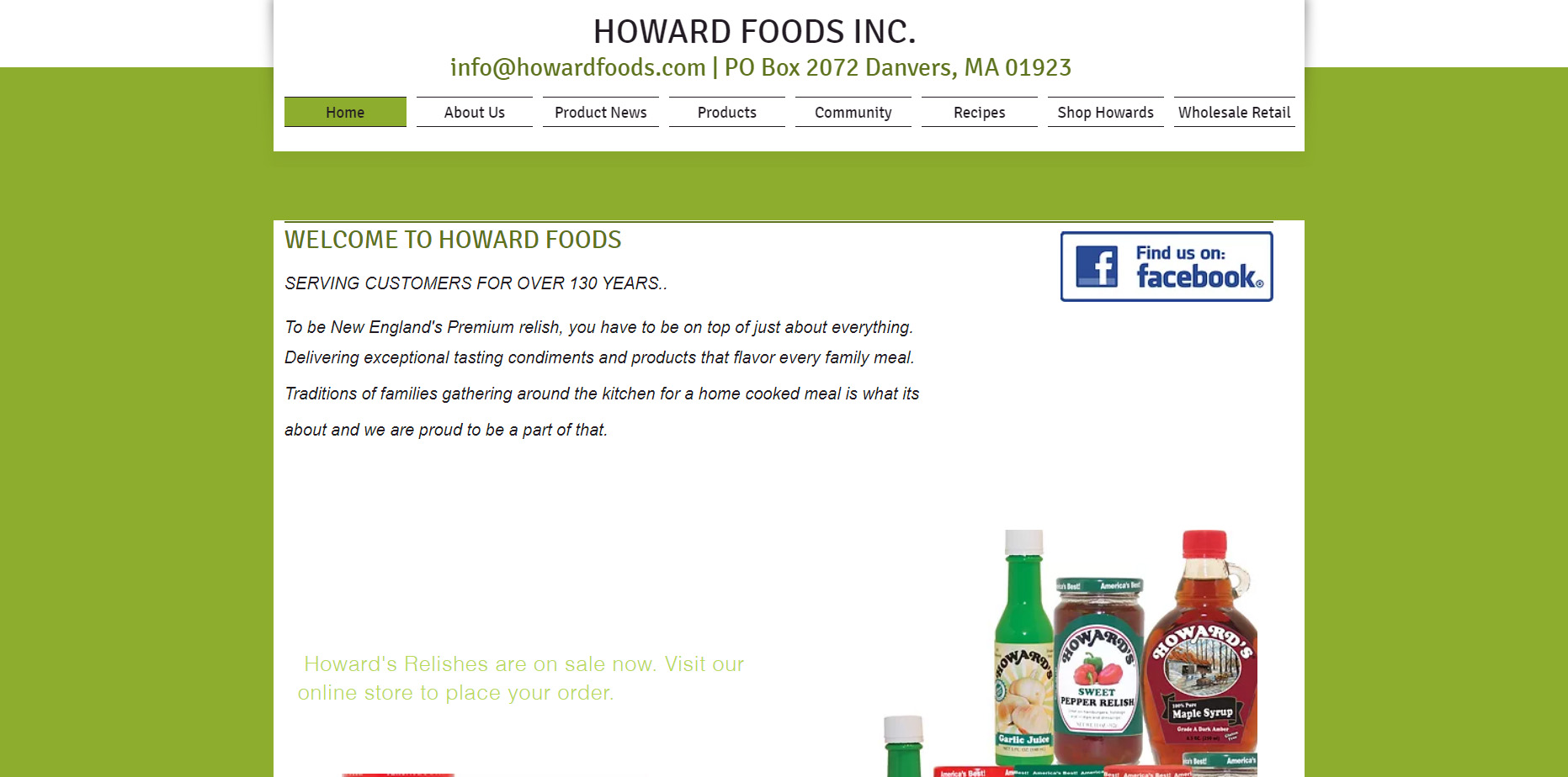
Old Site
Project Details
Client Name
Howard’s
Project duration
1 Month
Strategy
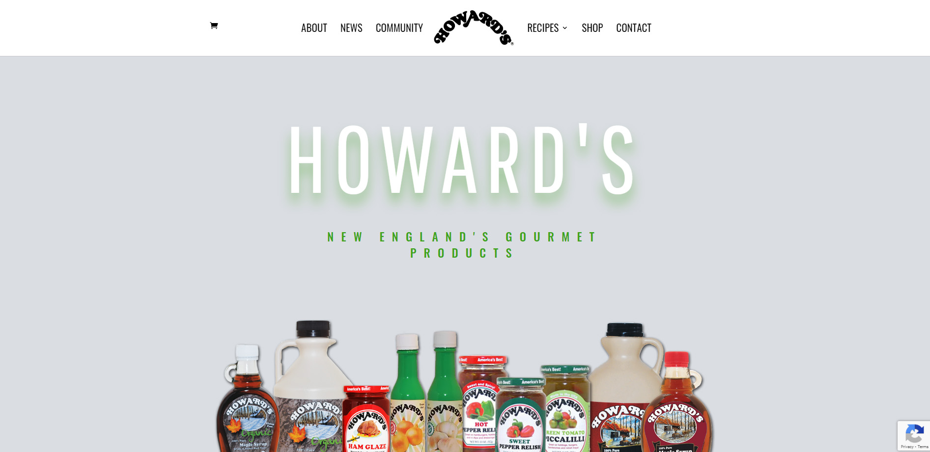
The new site was initially built on a staging platform while the old site remained live on Wix. Once the new site was complete and functional, I migrated it to the client’s new hosting platform on Bluehost and had the domain pointed to the new site. the new build has a modern and updated look and feel, and the user experience is easier in navigation and shopping. A WooCommerce shopping system was installed and the product template designs were created through Divi. Seo was included as well as mobile design.
UX Design
Divi was used to create a custom UX design through the theme builder. An easy-to-use navigation system was put into place and a proper hierarchy of information was created to sort pages and products. An easy cart system was put in place for shopping.

Visual Design
Divi was the theme used to customize the look. I used the original color palette from the former site in a slightly muted tone.

Vivid Green

Pale Grey

Almost Black

White
HEADERS
Aa
Pathway Gothic One 32pt
Pathway Gothic One 24pt
Pathway Gothic One 16pt
Pathway Gothic One 14pt
“Pathway Gothic One is a narrow grotesque sans typeface, a very popular style in the history of typography. This book weight is the first of many.” – From Google Pathway Gothic One Font
Body Text
Aa
Old Standard TT 32pt
Old Standard TT 24pt
Old Standard TT 16pt
Old Standard TT 14pt
“Old Standard reproduces a specific type of Modern (classicist) style of serif typefaces, very commonly used in various editions of the late 19th and early 20th century, but almost completely abandoned later. However, this lettertype still has at least two advantages:
- it can be considered a good choice for typesetting scientific papers, especially on social and humanitarian sciences, as its specific features are closely associated in people’s eyes with old books they learned on;
- the most beautiful examples of Greek and Cyrillic lettertypes were all based on the classicist style, so for those scripts, “Modern” fonts are much more appropriate than any contemporary (e. g. Times-based) designs.
The name “Old Standard” was selected as opposed to the “Obyknovennaya Novaya” (“New Standard”) typeface, widely used in Soviet typography, which represents another, slightly different type of the same Modern style. Of course this name doesn’t look very original, but it seems to be a good choice for a revival of the most common lettertype of the early 20th century.” From Google Old Standard TT Font

Mobile
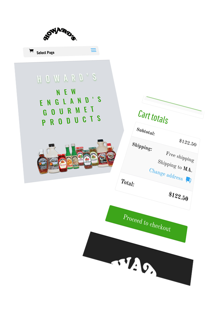
All pages were provided with a mobile design. An easy-to-use scrollable mobile menu and a touch-to-order mobile store.


