Montessori Advocacy Website
Desktop | Phone | Tablet | UX Design | Development| SEO | Migration
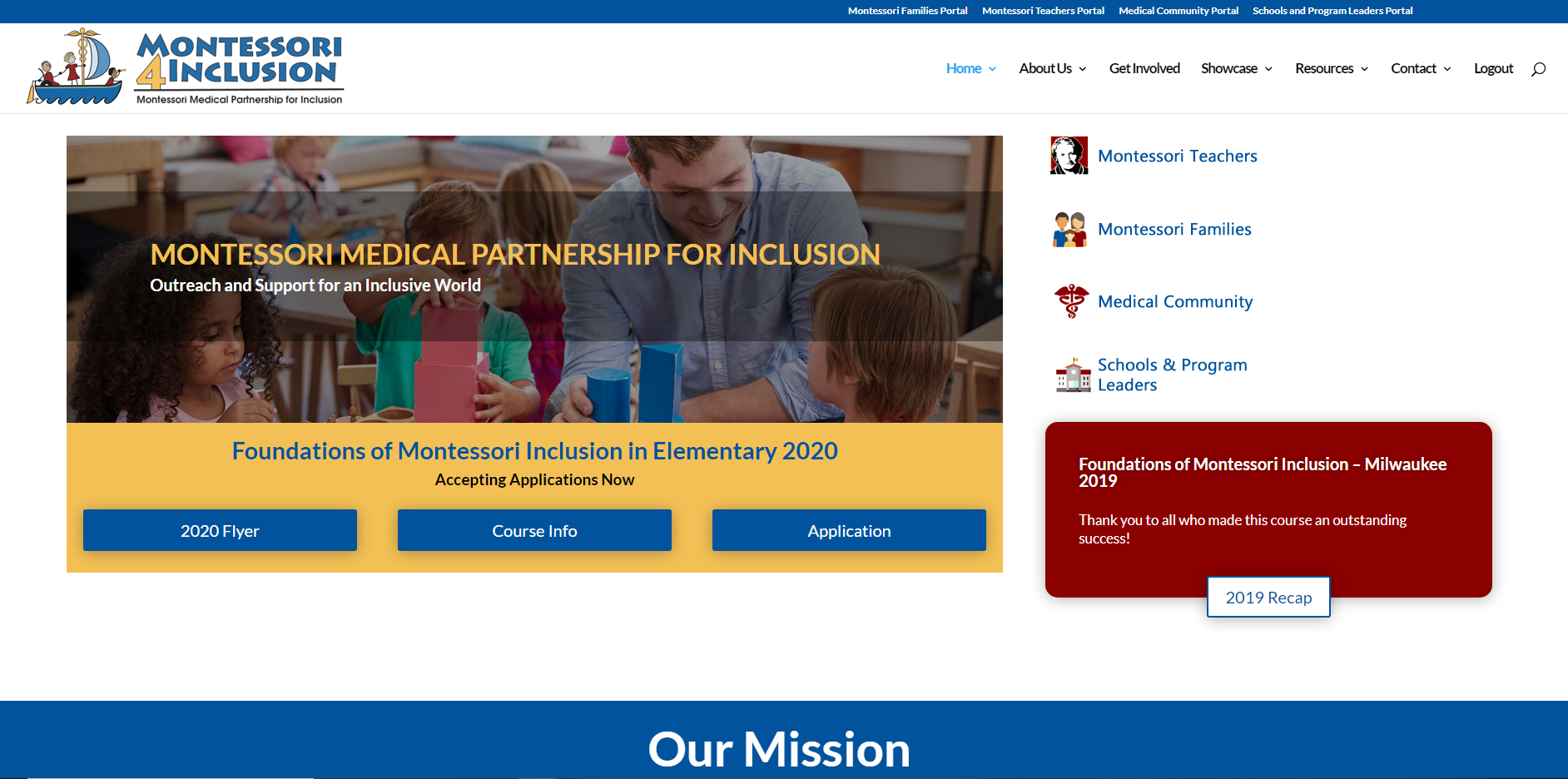
The most important aspect of the project was the rebuild. The original site had been taken hostage by its former developer. There were unfinished pages and non-functional elements. The site was rebuilt and the clients were given full control over their asset.
Project Summary
This website was completed with the WP codex and Divi. It was recreated on a new hosting platform to replace the existing site which had been hijacked by a former developer. The site features an all-new membership system integrated with their Mailchimp emailing system, a forum installed on the site, a custom article system, and much more.
The previous developers had limited the client’s access to their own website, an asset they should have full control over. Now they have full reign over their asset and can make design changes as they see fit.
Project Details
Client Name
Montessori 4 Inclusion/p>
Project duration
2 Month
Strategy
The clients had limited access to their asset and therefore I had limited access. I was unable to perform a site migration in the usual way. Because of this, I had to rebuild the site from scratch on a new server. And when the website was completed, the clients pointed their domain, which they had control of, to the new hosting account.
Since I was building the site on a new server prior to the domain being pointed over, we had time to complete the website in totality. All incomplete pages were finished and a back-end system was put into place so that the clients could alter and add to the site as they wanted. An easy-to-use system was put into place for their administrative use.
UX Design
Divi was used to create a custom UX design through the theme builder. An easy navigation system was put into place that differs for logged-in and non logged-in users. Easy forms were used to encourage new sign-ups to the site and also to encourage sign-ups for their yearly event. Many different elements were combined for a large and robust information-driven site.

Visual Design
The clients wanted a bright palette of colors to match their existing logo. These bright rainbow colors also play into the Montessori nature.

Blue

Red
#8b0000

Green
#669900

Yellow
HEADERS
Aa
Lato 32pt
Lato 24pt
Lato 16pt
Lato 14pt
“Lato is a sans serif typeface family started in the summer of 2010 by Warsaw-based designer Łukasz Dziedzic (“Lato” means “Summer” in Polish). In December 2010 the Lato family was published under the Open Font License by his foundry tyPoland, with support from Google.
In the last ten or so years, during which Łukasz has been designing type, most of his projects were rooted in a particular design task that he needed to solve. With Lato, it was no different. Originally, the family was conceived as a set of corporate fonts for a large client — who in the end decided to go in different stylistic direction, so the family became available for a public release.
When working on Lato, Łukasz tried to carefully balance some potentially conflicting priorities. He wanted to create a typeface that would seem quite “transparent” when used in body text but would display some original traits when used in larger sizes. He used classical proportions (particularly visible in the uppercase) to give the letterforms familiar harmony and elegance. At the same time, he created a sleek sans serif look, which makes evident the fact that Lato was designed in 2010 — even though it does not follow any current trend.” – From Google Lato Font
Body Text
Aa
Lato 32pt
Lato 24pt
Lato 16pt
Lato 14pt
“Lato is a sans serif typeface family started in the summer of 2010 by Warsaw-based designer Łukasz Dziedzic (“Lato” means “Summer” in Polish). In December 2010 the Lato family was published under the Open Font License by his foundry tyPoland, with support from Google.
In the last ten or so years, during which Łukasz has been designing type, most of his projects were rooted in a particular design task that he needed to solve. With Lato, it was no different. Originally, the family was conceived as a set of corporate fonts for a large client — who in the end decided to go in different stylistic direction, so the family became available for a public release.
When working on Lato, Łukasz tried to carefully balance some potentially conflicting priorities. He wanted to create a typeface that would seem quite “transparent” when used in body text but would display some original traits when used in larger sizes. He used classical proportions (particularly visible in the uppercase) to give the letterforms familiar harmony and elegance. At the same time, he created a sleek sans serif look, which makes evident the fact that Lato was designed in 2010 — even though it does not follow any current trend.” From Google Lato Font

Mobile
All pages were provided with a mobile design. The functional hamburger menu opens up to expose the many different page levels and scrolls so that users can see all items. All pages were fitted with custom font sizes for easy reading.

