Personal Plea Site
Desktop | Phone | Tablet | UX Design | Development | SEO | Launch
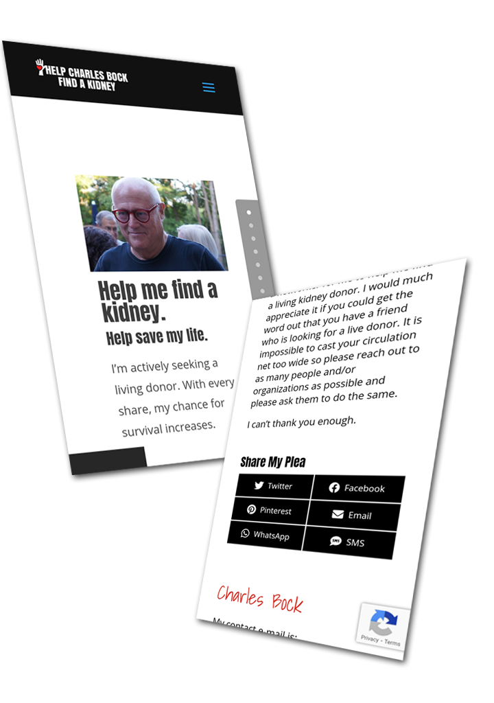
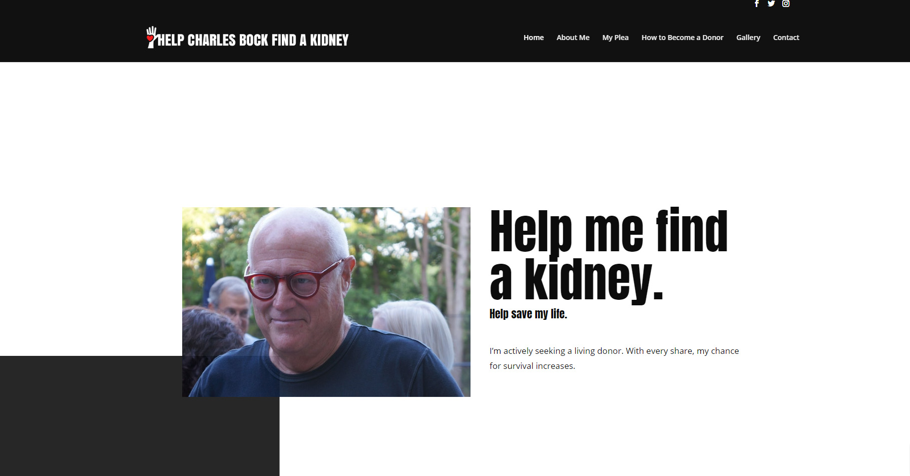
A brand new web build for a personal plea. This website was built with care and love for an individual with a message.
Project Summary
This was a brand new build on a GoDaddy Managed WordPress hosting account. A simple project specifically designed for sharing and getting the word out.
Project Details
Client Name
Save A Friend in Need
Project duration
1 Month
Strategy
The site was built using the WP codex on a shared hosting environment. The site was built with Divi and a custom template made to create a simplistic design that would highlight the message. A custom logo was created as well.
UX Design
The design and color schemes were created using Divi. Scroll snapping and scroll movement of elements were created on the first page to showcase all facets of the site. The user can easily scroll through the first page to view the entire message. Easy share links to encourage sharing were placed throughout.

Visual Design
Divi was the theme used to customize the look. We used a simple color palette consisting of mainly golds and blacks to create a distinct look and feel to complement the theme of “Luxury”.

Dark Gray
#111111

Silver
#898989

Black
#00000

White
HEADERS
Aa
Anton 32pt
Anton 24pt
Anton 16pt
Anton 14pt
“Anton is a reworking of a traditional advertising sans serif typeface. The letter forms have been digitised and then reshaped for use as a webfont, the counters have been opened up a little and the stems optimised for use as bold display font in modern web browsers. Anton language support includes now African Latin and full coverage of Vietnamese, additional to all Western, Central, and South-Eastern European languages.” – From Google Anton Font
Body Text
Aa
Open Sans 32pt
Open Sans 24pt
Open Sans 16pt
Open Sans 14pt
“Open Sans is a humanist sans serif typeface designed by Steve Matteson, Type Director of Ascender Corp. This version contains the complete 897 character set, which includes the standard ISO Latin 1, Latin CE, Greek and Cyrillic character sets. Open Sans was designed with an upright stress, open forms and a neutral, yet friendly appearance. It was optimized for print, web, and mobile interfaces, and has excellent legibility characteristics in its letterforms.” From Google Open Sans Font

Mobile
All pages were provided a mobile design which does not include the scroll snapping or element movement for an easier experience.

