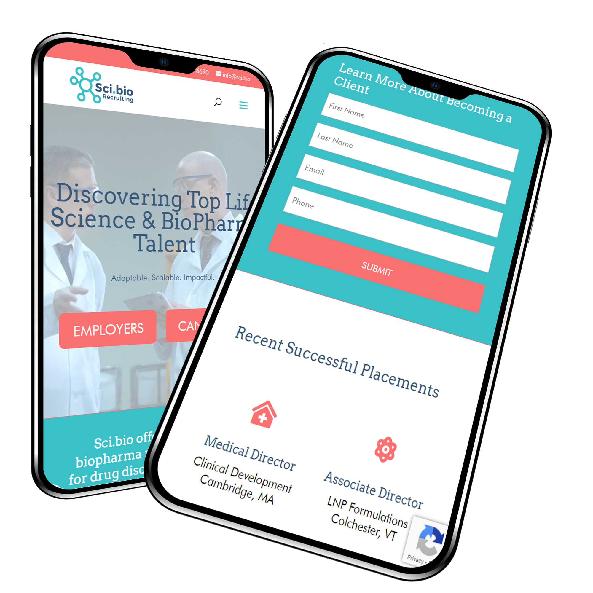
Scientific Recruiting Website
Desktop | Phone | Tablet | Website Design Overhaul | Redsign and Rebuild | CTA Rebuild | Content |
The existing WP site was only a year old in terms of design and the new design had experienced a decrease in conversions. I rebuild the website with a full new design and UX experience with a focus on increasing conversions.
Project Summary
The new site was built out on a staging platform along with a style guide for the company and branding. The rebuild employed a new color palette, a better UX experience, and an emphasis on increasing conversions. After the build, the site design was transferred seamlessly to the existing website.
Project Details
Client Name
Sci.bio
Project duration
3 Weeks
Strategy
The site was built on a staging platform on a clean WP install. Current plugins and processes were ported over to the staging site so that a full new design could be implemented. Developing a better consistency with CTA factors to enhance conversions was a priority. Once completed, the site design was transferred by hand, page by page, to the existing site so as to not interrupt the intracacies of the existing website.
UX Design
The design was completely overhauled and developed by Turbo WP Devs. After a few iterations, we developed a design and brand feel that was accepted by the client. The overall UX design was improved to make for a better experience for the different types of users that would visit the website.

Visual Design
Salmon
#f97171
Aqua
Dark Navy

White
HEADERS
Aa
Arvo 32pt
Arvo 24pt
Arvo 16pt
Arvo 14pt
“Arvo is a geometric slab-serif typeface family suited for screen and print. The family includes 4 cuts: Roman, Italic, Roman Bold, Bold Italic. It is a libre font, first published in Google Fonts. The flavour of the font is rather mixed. It’s monolinear-ish, but has a tiny bit of contrast (which increases the legibility a little in Mac OS X.)
The name Arvo is a typical Estonian man’s name, but is not widely used today. In the Finnish language, Arvo means “number, value, worth.” Considering how much programming is involved in hinting, all these meanings are true.” FromGoogle on the Arvo Font
Body Text
Aa
Futura Book 32pt
Futura Book 24pt
Futura Book 16pt
Futura Book 14pt
“First presented by the Bauer Type Foundry in 1928, Futura is commonly considered the major typeface development to come out of the Constructivist orientation of the Bauhaus movement in Germany. Paul Renner (type designer, painter, author and teacher) sketched the original drawings and based them loosely on the simple forms of circle, triangle and square. The design office at Bauer assisted him in turning these geometric forms into a sturdy, functioning type family, and over time, Renner made changes to make the Futura fonts even more legible. Futura’s long ascenders and descenders benefit from generous line spacing. The range of weights and styles make it a versatile family. Futura is timelessly modern; in 1928 it was striking, tasteful, radical — and today it continues to be a popular typographic choice to express strength, elegance, and conceptual clarity. NEW: the new Futura W1G versions features a Pan-European character set for international communications. The W1G character set supports almost all the popular languages/writing systems in western, eastern, and central Europe based on the Latin alphabet including Vietnamese, and also several based on Cyrillic and Greek alphabets Futura® font field guide including best practices, font pairings and alternatives.” From MyFonts.com

Mobile
The new site design included a mobile site design for ease-of-use on mobile devices.

